Sunday, December 22, 2013

Winter Wonderland


I was asked to do the stage and event decor for a Winter Wonderland themed appreciation show. The budget was pretty tight, so I basically scoured the nearby parks weekly for fresh pine and pinecones and tree parts and other natural looking yet wintery things to use for decoration.
I pretty much became craftzilla in my basement, preparing all the paper snowflakes and items for the stage, while binge watching episodes of Community and Buffy.

Anyway here are some photos of the event and some of the stuff I worked on: invitations, all signage, photobooth, stage, centerpieces, and overall space.

You can check out the event photos here, and here.

Monday, December 9, 2013

Thursday, December 5, 2013

sidecar

Boyfriend bought a motorcycle a few years ago. He took it apart and I've never seen it since, but if I could get my hands on it, I'd add a sidecar.

Friday, November 15, 2013

pitches, pitches, pitches!

Was at the Health Hackathon and our exuberant MC of the event excitedly exclaimed, "Pitches! Pitches! Pitches! Are we reaaaady for Pitches!!" to start off the night. (And it sounded like otherwise)

Tuesday, November 12, 2013

Hacking Health Toronto


Just this past weekend I attended a Health Hackathon at MarS Discovery District. It was a three day hackathon that began with 35 pitches delivered by individuals in Toronto's healthcare community. We then formed teams by choosing projects we were interested in and then worked on solving the issue throughout the weekend. On the final day we were to submit a working demo and deliver a 2 minute pitch about our solution.

I joined a team working on creating an integrated care pathway (ICP) model for a concurrent disorder, Major Depression and Alcohol Dependence. An ICP has clear guidelines, protocols and algorithms of what standard care should look like for a patient with this diagnosis. It is also a vehicle to bridge evidence based research with evidence based practice. The pathways incorporate process maps, checklists, medication algorithms etc.

Our group decided on creating a digital tool that aimed to help the clinical team keep track of client outcomes, assess trends in clinical outcome and provide a pathway dashboard to illustrate 'where is the patient in their care?' And 'how they are doing'

Monday, October 28, 2013

The development cycle is abstract

The development cycle is abstract.
I think this sums it well. I've been trying to figure out how to describe my design process, because personally, I feel like it differs from one project to the next...and it should! I mean, there is no sure-fire one method to solve problems.

Wednesday, October 23, 2013

Conversations with J


I met up with an old friend in Vancouver in April, and had a wonderful conversation. It was a really nice reunion and he is one of the few who understands both sides of my life. Anyway, I didn't have a pen so I transcribed as much as I could on the ipad.. if you can read it. Otherwise...


On the topic of creativity, and being a good artist, wherein my friend is afraid that his work is too 'safe'..

"I would like to live a simple life. Just a bed and a desk, nothing. What is all my stuff worth?" J asks.
Is he too safe? He is not a crazy artist/creative person (he is very balanced), so his work is 'safe'. Therefore there is no 'edge' in his work. But is that what makes better work? Craziness? Unbalanced-ness? I postulate.

"I think you cannot gauge art against other art. As there are different artists out there, they each have their own strength, quality and style. Can you say who is better, Picasso or Mondrian? What one admires in Keith Harring for Keith Harring's style is uniquely his and is something Yoshitomo Nara will not come up with." I reply.

"But," J argues, "What is skill?"

"To me, drawing is a skill, that is something you can sharpen. Draw all day, every day and you will improve. Guaranteed. Actually the question is perhaps, 'What is talent?'" I continue, "Talent is creativity and skill. Because you can have talent, but you need skill to ---- that talent into something understandable for other people."

"That's not true" he argues, "you can sit and do things 10x faster than the normal 'untalented' guy. I don't argue, that creativity comes from character and experiences, drawing is a skill you hone/sharpen. That will make you faster and more adept at it. It is a mental model perhaps even. But creativity? That cannot be trained!" At this point he seemed exasperated.

Hard work pays off, promise.


Friday, September 27, 2013

insight

Research is important, but experience is necessary.

My portfolio is finally finished. Please, take a look and enjoy!
www.carmenliu.com

Wednesday, September 25, 2013

self portrait, 2011


Its digital! my doodles just went next level. This is my 2011 self.


Tuesday, August 13, 2013

notebooks

I was in a cleaning frenzy and emerged hours later with 11 new notebooks. I couldn't help it.


These are ~5.5" x 8.5" full bleed except for the blue. Does anybody want the magenta one? I have two....


Monday, August 5, 2013

Stamp of approval


This marks the end of the conference! Each person gets a stamp commemorating their attendance of this event in their passbook. I guess I could have gone for an even larger circle stamp..


Saturday, August 3, 2013

Did You Know posters


And they are up! There are 28 in total.

Exhbit-B - Behind the scenes

Because the focus of the conference is on education, we created an extra side exhibition based on understanding how much work is involved in creating the conference. We wanted transparency so participants can see that there is more than just speakers and performers coming up on stage on time and that their subdivisions could host a conference if they wanted to too.

In order to be brief and succinct, I was only able to list out major departments on why they are important and their main tasks and/or difficulties. Originally, if given more space, I would have pinned real objects, photos, and drafts of proposals stacked in a pile. 


original space, then cut down in half..

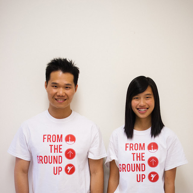
IBLYARC - Teeshirts

*thank you for modelling

The shirts are on! And real people are wearing them!!

Friday, August 2, 2013

Participant package

The participant package includes the following items:
  • A pen
  • 8gb USB
  • A single pack of swappable pins
  • Cotton drawstring backpack
  • Conference lanyard and namebadge
  • Handbook
  • Sponsorbook
  • Tee shirt (not pictured above)


Sunday, July 28, 2013

Stage set up

It's happeningggg. This was a full weekend of work... and then some.


Production time

Pins and packaging! (The packaging made all the difference)

Finally, everything is getting printed and ready to be cut and prepped for the conference. I am currently running on a 24 hour schedule (which is ridiculous, I know) It goes something like this: 
"Wake up" prep most files for printing
10am get temple, print files, prep for volunteers
1030am, meet volunteers and delegate work/give instruction and watch
12n, eat lunch
1pm Head back to the office to do some design work to print, so people can help put things together
4pm Check up on volunteers, print more items, give new instructions
6pm dinner
7pm-1030pm update meeting
11pm - ??am finish designs on items for next day's production end of workflow 

luggage name and room tags

Did you Know?


This is a series of posters titled, Did you know? containing interesting facts about Buddhism or BLIA or YAD. The idea was initiated by the fact that the dining hall has Chinese calligraphy paintings on the walls and many of the participants cannot read Chinese, so we were to make an English replacement for the walls that would be equally interesting for them to read.

The difficulty here was finding a font that would be appropriate and easy to read. The poster is placed fairly high up and the text varies in length.

In the end, due to the fact that the English language takes up 2x the space that Chinese characters do, we doubled the width of the posters and added some colour to make it look less serious and more fun.


Thursday, July 18, 2013

IBLYARC Stage


A stage decoration was asked for two events during the conference, the Welcoming Dinner and the Buddha's Light Night. They wanted something that said, "Hey, look, we (Toronto) are your hosts, but we are happy you (any other city, Canadian or American) are here too with us." without looking nationalistic (via hanging a big flag) and looking like a political campaign. 

So I set to create a cityscape that held icons from each participating city in the conference. From left to right: Dallas (Tower), Orlando (Disney), Edmonton (City hall), New York (Liberty), Toronto (CN tower), Montreal (Biodome), Vancouver (Totem pole), Fremont (City hall), and Los Angeles (Hollywood).

Construction first draft

Construction took a while to figure out. We wanted something that wouldn't take up too much stage space and wouldn't fall over when people are dancing on stage. In the end we built everything out of foamcore and supported it with wooden posts and bags of rice as weights. A light ran between the skyline and the buildings to create extra depth and shadows.


Wednesday, July 17, 2013

IBLYARC signage


Signs! These things are everywhere, helping direct traffic, helping lost participants find their workshops, helping registrants locate their items, etc. With such a large committee organizing different things there was no way we would be able to guess what everybody would need from our team for certain planned events. We sent out a notice for each department to register (by a certain date) for any signage ("service") they needed from us for their event/sessions and our team would make them, print them, and leave it in a box for pick-up. This communication worked out super well because it saved us from wasting work and time. Woohoo!

Thursday, July 11, 2013

go team!

Man this is going to be a rough month.

Monday, July 8, 2013

Luggage tags

The accommodation team needed something that would allow us to identify and separate luggage from different cities so when they transport them from airport to hotel so it doesn't get confused in the shuffle. I made the luggage tag only under the instruction of "make me a luggage tag" so I drafted one up quickly. Meanwhile another team felt that the tags were not suited to their needs, so we made a second type that was 17" long and had each individual's last name written on it. Later we also colour coordinated the tags with a coloured ribbon for easy sorting. A specific colour for each city.

drafts


Sunday, July 7, 2013

meow

I think you would.

Tuesday, July 2, 2013

Steve Hon prints shirts

This guy prints my shirts. He's really super!

Thursday, June 27, 2013

IBLYARC handbooks


A series of covers were made for the conference handbook. The handbook holds the conference schedule, rules and regulations, and all sorts of handy information. I assumed there would be a little more freedom with the design so I threw some more fun ideas into the mix.

In the end, none of them were chosen and a cover made for the sponsorbook was revamped for the handbook.

Thursday, June 20, 2013

Conference souvenirs - teeshirts

Choices, choices. Since the bags ended up as red, I went to look for something that wouldn't interfere too much with the red backpack. There was a moment of alarm when the committee head asked for a red shirt, but we fixed that. Ash grey seemed like a pretty safe idea, but in the end we went for white.


Monday, June 17, 2013

Sponsorbook sketchbook pages


Working on a hunch for a background for the sponsor pages. A light image of the youth working together, happy and collaborating, and on top, are our sponsors, helping us make it happen.

Saturday, June 15, 2013

Nametags, lanyards


Lanyards are for keeps, but the nametag usually just gets thrown away. The biggest difficulty was actually in finding a supplier who will get us 3/4" wide lanyards for cheap at a small volume. Who would have guessed these one-time-use neck things cost so much! Even though the design was approved early, we couldn't find a reasonable supplier until a few months later and forgoing local Canadian distributers. 

For the lanyard, I thought it would be fun to place the maple flag in the center. It gives it more of a graphic element to the whole piece. I also did some more serious looking ones just in case. The Olympics was a good visual resource for these. On the back of the neck is the Toronto cityscape, or a Canadian icon so when people are taking photos you'll still be able to see something if you're turned around.

For the nametags, there were originally four colour distributions for different levels of participants, staff, participant, venerable, and special guest. However, we boiled it down to just two for two colours: participants and staff. Special guests received a pin badge and a corsage instead.


Thursday, June 13, 2013

Graduation

That's it! Four years (five including a year abroad) ago just classmates and now pretty much family.

Woohoo! Also, I found out that Wonjoon was fooling me the entire time in second year about failing students  T_T

Tuesday, June 11, 2013

Conference souvenirs - pins

The logo is round, pins are also round. So hey, why not!
Even though I don't really like pins, I'm pretty excited about the turnout for this souvenir. We made four designs in four colours and will be handing them out at random to encourage participants to swap and trade their pins with their new friends.


Sunday, June 9, 2013

Who's ready for some "choowaa bing"?

I was thinking of a witty slogan for shaved ice, but I realised that only people in my generation and younger would get it and all the adults would be left confused.

Friday, June 7, 2013

Conference souvenirs - backpack

One of the souvenirs for the conference is a drawstring backpack. These are handy because participants have stuff to hold like their schedule, notebooks, pens, waterbottle, and etc.

I suggested tote bags, but tote bags are apparently girly, so we went for backpacks. Finding a good supplier who can get us a good quote for such a small volume was one of the biggest difficulties here. Second was finding a cheap canvas or cotton tote, rather than going for that wishy-washy weird-feeling waterproof material. Nonetheless we found one in the states and got it shipped to us JUST IN TIME for the conference.


I made four options to choose from. The bag was requested to be in a red colour, and the more colours you screenprint the pricier it gets so I kept everything white.

Final decision! We went with this one!


Tuesday, June 4, 2013

A passport stamp


For each conference, a stamp is stamped into the participants' YAD passport marking their attendance to the year's conference. I was looking to make something very immigration-like. A play on the fact that it is a "passport stamp". 

However, in execution, the reality was that there were size constraints, cost constraints, and even shape constraints on the stamp. Plus, the text could not get too small or else they will turn into a blob..especially Chinese characters. 

What's neat was that I worked with a stamp-maker remotely through online video chatting and screensharing as we shared my ai file. Technology these days! I was pretty impressed since my own skype can't really hold a stable connection on most days.


Friday, May 24, 2013

Double bike

My friend can't decide if he wants to ride his motorcycle more or his bicycle more. The suggestion is that he could just carry one on his back. hmmm...

Wednesday, May 22, 2013

Canadian tings

I made a list of things that were Canadian as a mini brainstorm for the conference. There's surprisingly a lot of notable things!